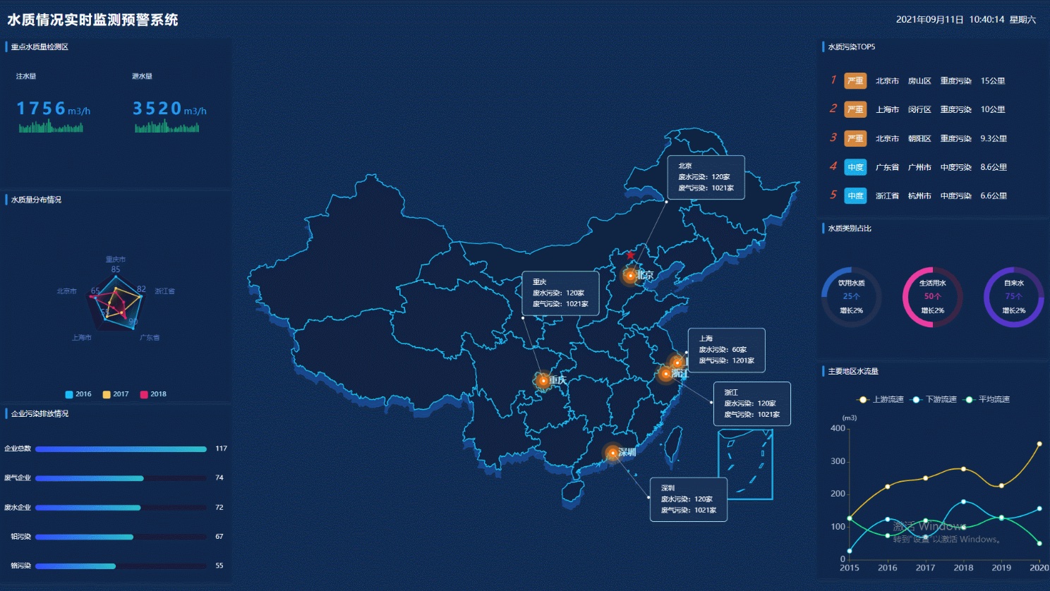
Recently, I was assigned another GIS dashboard project. My manager asked me to research the mainstream design styles currently on the market. Coincidentally, I had previously introduced a collection of such dashboard works in an article titled "Open-Source Dashboard Templates for GIS Developers: BigDataView Project". Combined with various examples shared within our community group, I managed to complete the task.
During the research process, I noticed an interesting phenomenon: many dashboards still use maps in the EPSG:3857 projection, which results in a "tilted" depiction of China's map. Therefore, using OpenLayers and Leaflet as examples, and with the help of various AI tools, I created two demos to implement the rendering of the Albers projection on the web.

